HOW TO CREATE AN ILLUSTRATION: BASIC IDEATION TO FINISHED ILLUSTRATION
Before I started art school, I believed that great artists would just sit down and make a masterpiece. Now, I realize that a lot of planning and work is involved in creating a finished illustration. With this in mind, I will visually demonstrate my own process of how to create an illustration, from start to finish.
THUMBNAILS
For one project, the prompt was “Castle in the Sky” and I created 25 thumbnails to represent that idea. Some projects will require more thumbnails, some less. The best advice I received was to keep going until your brain has been fully purged of ideas; this may require taking a break from the thumbnail process until you have new ideas. But once you feel as though you’ve exhausted every possible idea and composition, it’s time to move on and analyze. Your best idea may be your first or your last, but you won’t know unless you get them out of your head. The best part about thumbnails is you can store them away and come back to search for new ideas! When I want to create something new and don’t know what, I will often pull out my old thumbnails and find compositions or ideas to explore further.
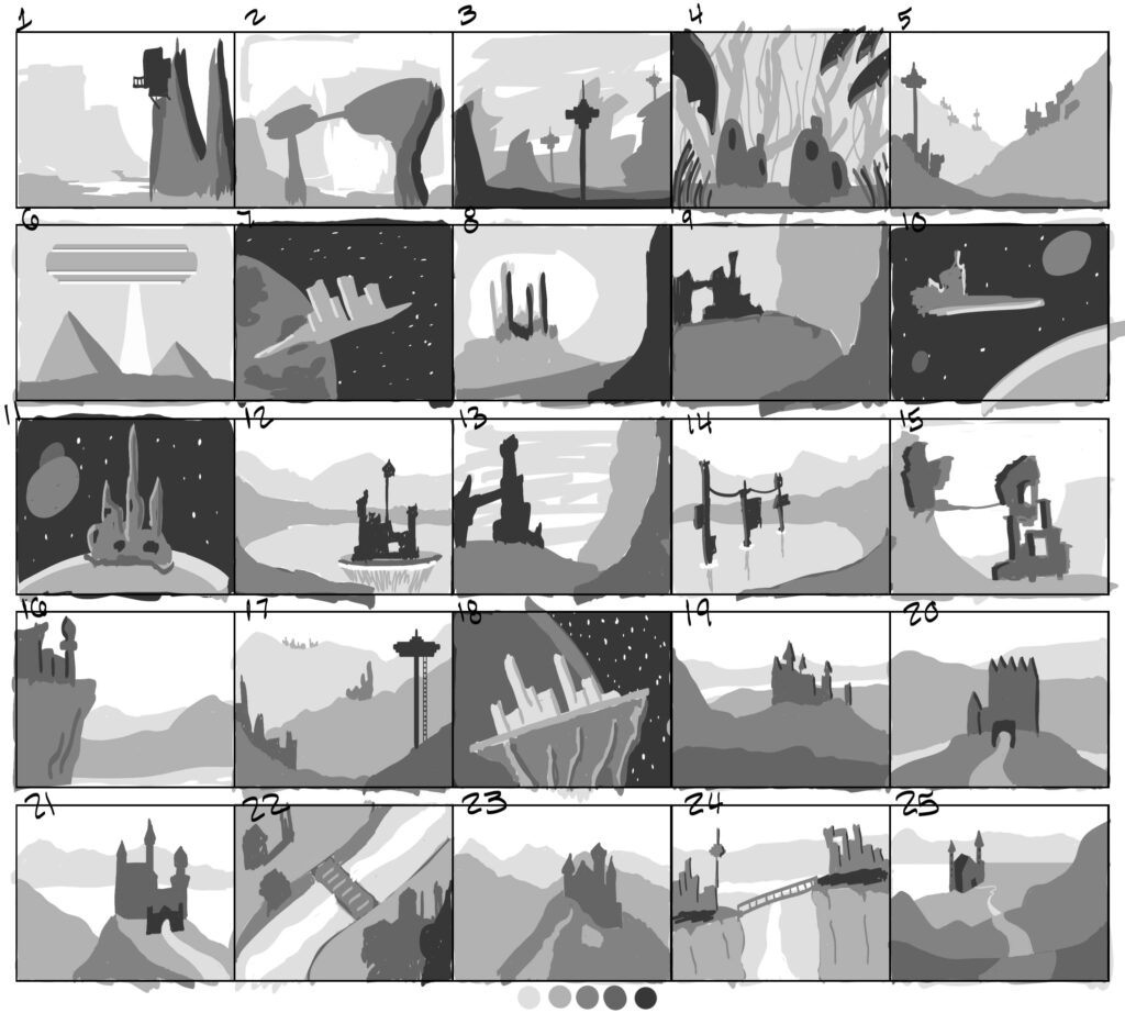
ILLUSTRATION PROCESS: LINEWORK
After putting my ideas to paper, I realized that the “space needle-esque” motif (thumbnails 3, 5, 12, 17, and 24) appeared multiple times in my ideation stage and I decided to explore it further.
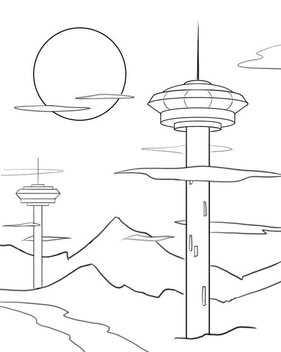
After refining the idea, I came up with this general linework. Some minor things may change between this and the final illustration, but I will continue to refer back to this drawing when it comes to composition. I don’t typically use linework in my final illustrations but this drawing helps define the general layout without spending too much time on values or details.
ILLUSTRATION PROCESS: VALUES
After determining the general composition of the drawing using lines, the next step is values!
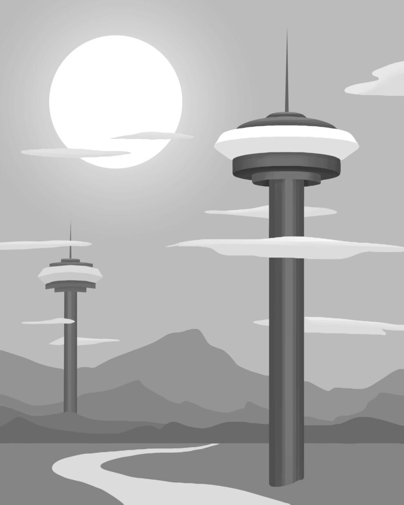
This is typically when I ditch the lines and rely on value contrast to differentiate elements of the illustration. Areas with the most contrast tend to draw the eye, so I’ve ensured that the tower in the foreground contrasts with both the ground plane and the sky by making it the darkest value within the illustration. As you can see, a few aspects have changed between the linework and value study: I added a few more ranges of mountains and changed the shape of the river so it flows back into the illustration rather than out of frame. The thumbnail through value stages are when you should experiment the most, before setting things in stone with color and finishing touches.
ILLUSTRATION PROCESS: COLOR STUDIES
After values comes my favorite part, adding color!
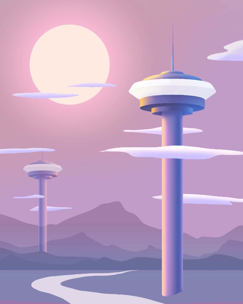
In this color study, I’ve tried to maintain the contrast between the towers and background as seen in the value study by pushing the highlights and shadows. There are many different ways to create color studies and it will depend on what works best for you. Personally, I like to use adjustment layers and gradient maps, but adjustment layers are most accessible in Adobe Photoshop and not as useful in other programs. If you’re working in another app such as Procreate or ClipStudio, I’d recommend applying gradient maps and tweaking the hue/saturation/curves/etc, until you’re happy with the end result. Typically, I will create a copy of my value study and combine the layers so I’m able to apply the gradient map to the entire piece while still keeping my values separate in another file in case any further tweaking is needed. You may also find it useful to combine and isolate specific elements of the illustration (i.e., the towers, ground, sky, etc.,) rather than applying the gradient map to the entire piece.
ILLUSTRATION PROCESS: FINISHING TOUCHES
Time to apply the colors from your color study as well as any other finishing touches!

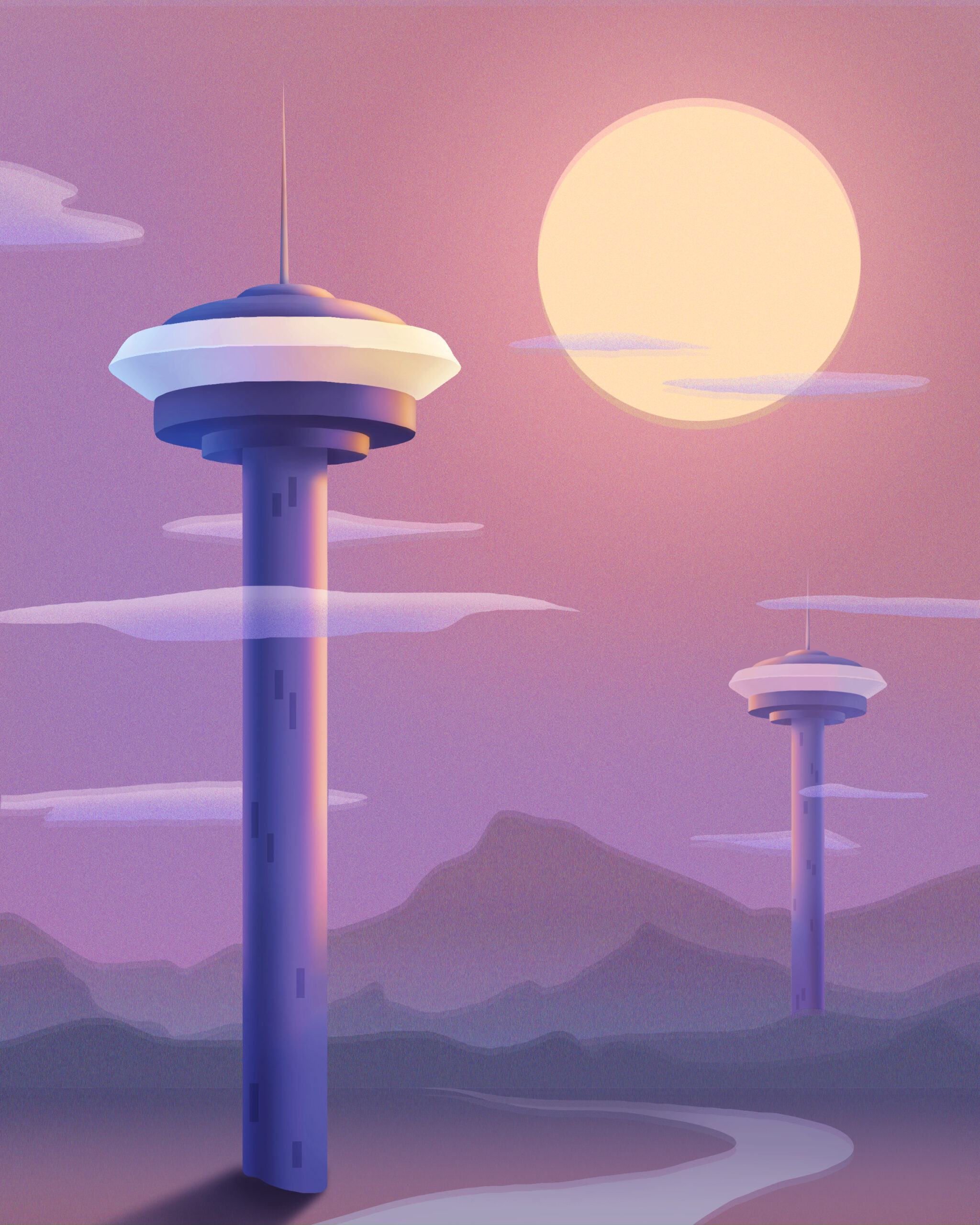
As you can see, my final illustration does not perfectly match my color study. This is because color studies are a general idea of how colors will interact with each other, but small tweaks to saturation and hue are possible and can be helpful. Becoming too attached to your illustration at any stage can be detrimental because it can close your mind to other possibilities. This is why it’s best to stay loose and open to other solutions throughout the process of creating your illustration. While drawing, it can be helpful to flip your canvas to ensure your illustration is readable, especially if you are drawing faces or figures! Throughout the process, I realized that I liked this illustration more when it was flipped horizontally because of the Western tendency to look at images from right to left. When it comes to finishing touches, I added shadows, more detail, and a slight blur to the background to represent heat waves and bring the towers to the foreground.
FINAL REMARKS
I hope this breakdown of how to create an illustration assisted you in your artistic journey! Feel free to reach out via email on my Contact page or through Instagram if you have other questions or need more insight, I’m always happy to help other aspiring artists! Thank you for reading and I look forward to seeing the illustrations you create!
